Supply Your Own Artwork
Already have a designer? Supply your artwork to spec and we'll load it for you. Full technical specifications provided on booking.
Great design gets attention. Strong creative drives action. A billboard isn't a website or a flyer. It's a few-second opportunity to make an impact on someone travelling at speed. Studies show drivers spend just 1.6 to 2.4 seconds looking at a billboard, so every element has to earn its place.
Follow these seven simple rules and your creative will cut through, stick in the memory, and drive results.
Source for viewing-time stat: Nielsen Out-of-Home Advertising Study.
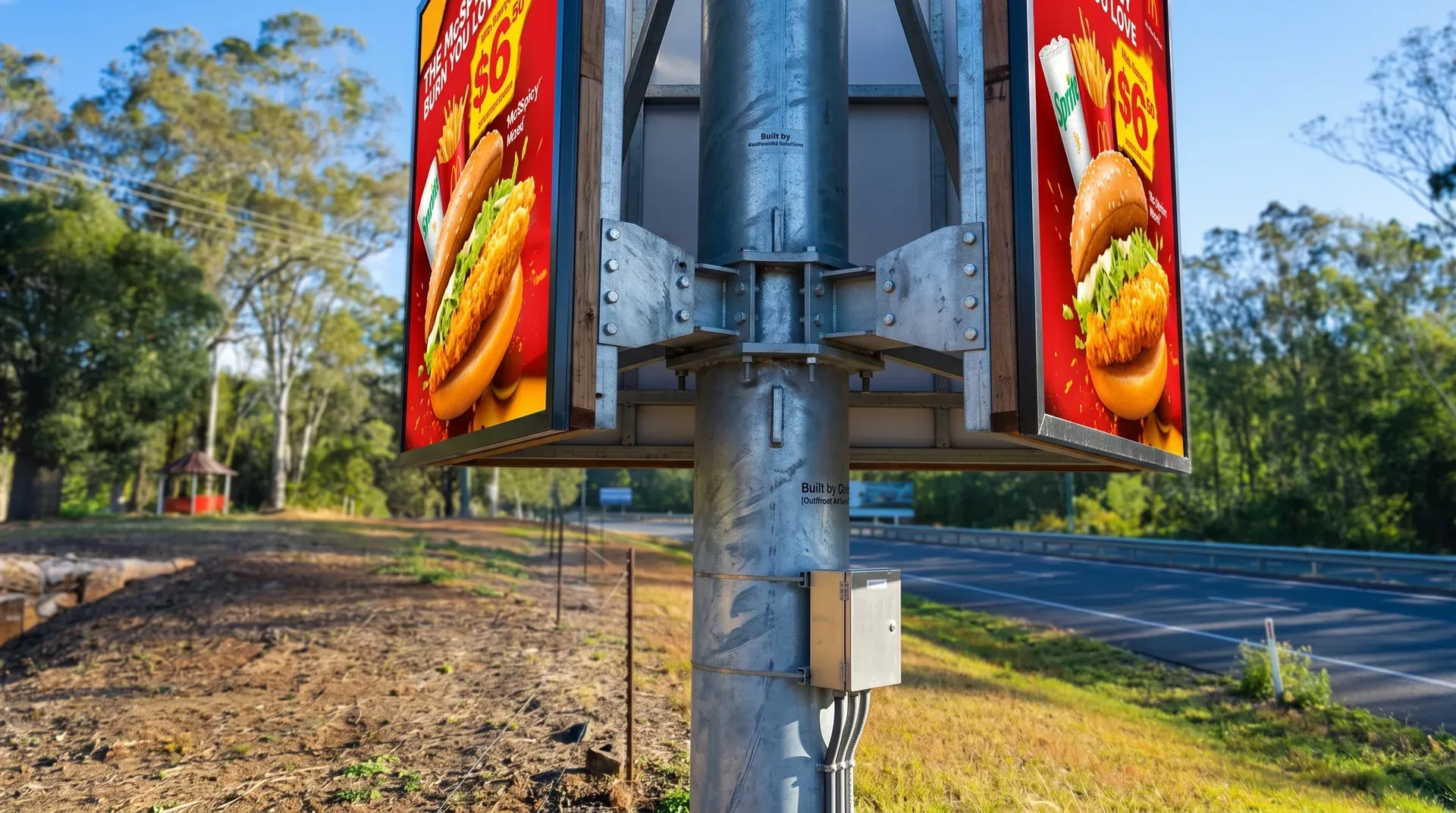
Your headline should be readable in under three seconds. Keep it short, punchy, and unforgettable. If you can't say it in seven words, cut it down.
DO: "Toowoomba's Best Burgers. Open Now."
DON'T: "Come and visit us for the best locally-sourced gourmet burgers in Toowoomba, open 7 days a week!"
A single powerful image makes your ad memorable. Use one dominant visual, not a collage. Your image should work with your message, not compete with it.
DO: A hero product image with breathing room.
DON'T: Multiple small photos or text layered over a busy background.
Tell people what to do next. A phone number, a website, or a simple instruction gives your audience a clear step. Research shows billboards drive far more action when paired with a clear CTA.
DO: "Call 04XX XXX XXX" or "Visit aceofadvertising.au".
DON'T: No contact details and no next step.
Your text must be readable at a distance and at speed. Always use strong contrast: dark text on light, or bright text on dark. Around 60% of viewers find billboards more attractive when they use bright, contrasting colours.
DO: White text on a dark background, or black on white.
DON'T: Yellow on white, or grey on light grey.
Your logo should be clearly visible but shouldn't take over. Your message comes first; your logo confirms who's speaking. Keep it in a consistent corner.
DO: A clear, unobstructed logo in one corner.
DON'T: A logo taking up more than ~20% of the creative.
Every extra element reduces impact. If something isn't essential, remove it. White space isn't wasted; it gives your message room to breathe and be absorbed.
DO: Headline + visual + logo + one CTA.
DON'T: Multiple headlines, bullet lists, several images, social handles, and fine print all at once.
Your audience is in a moving vehicle. Your ad needs to work at highway speed, from 100+ metres away, in bright sun and at night. Our P6 high-resolution LED screens use adaptive brightness to display your creative optimally, but the design still has to hold up at a glance.
Not a designer? No problem. Our creative team produces professional, results-focused billboard artwork that follows every one of these rules, so your brand shows up looking its best.
Already have a designer? Supply your artwork to spec and we'll load it for you. Full technical specifications provided on booking.
A one-off creative setup. Professional, on-brand artwork in the correct format. Includes your choice of artwork supply, creative refresh, campaign creative package, or multi-message package.
For businesses who want fresh, relevant creative throughout their campaign. Our team handles everything: seasonal artwork, updated offers, and priority turnaround.
Supplying your own artwork? Here are the technical requirements for the Range Gateway Billboard screens:
Not sure your file meets spec? Send it to hi@aceofadvertising.au and we'll check it for you.